Black Poster & Zine
Client: Natsuki Yasuda
Designer: Trouver
2023
Paper:
Gmund Colors Matt 10 - 100g/m2
Printing:
Digital Silver
Post-Press:
N/A
More Detail:
In Pursuit of "Black" Ideal
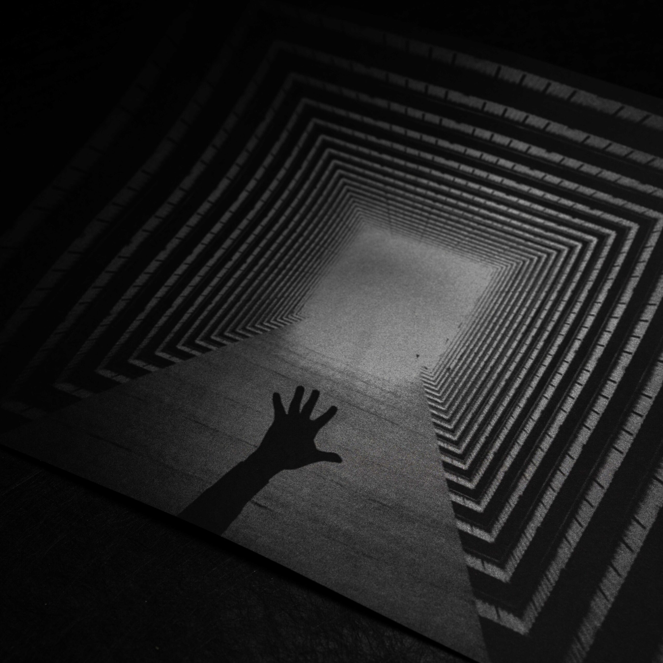
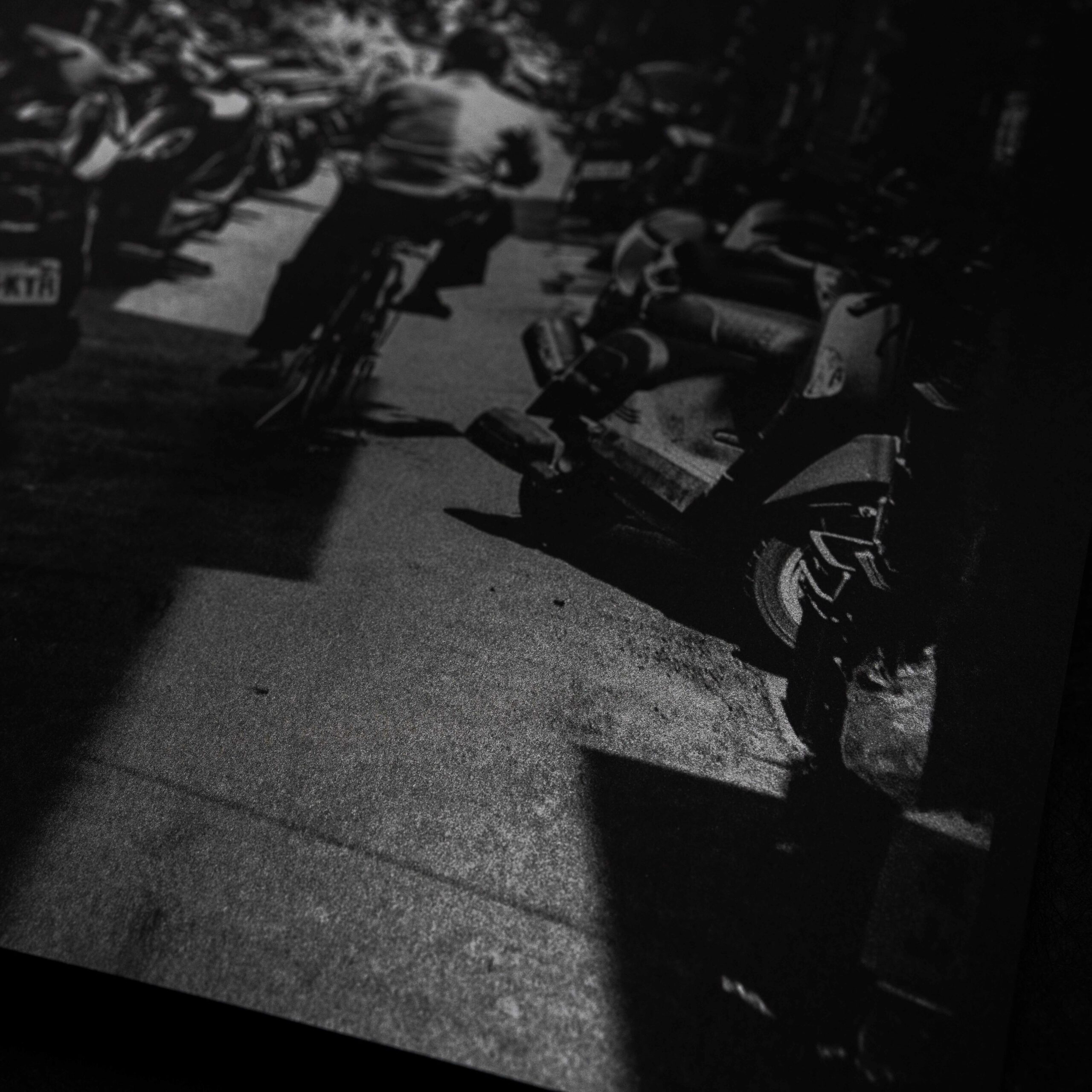
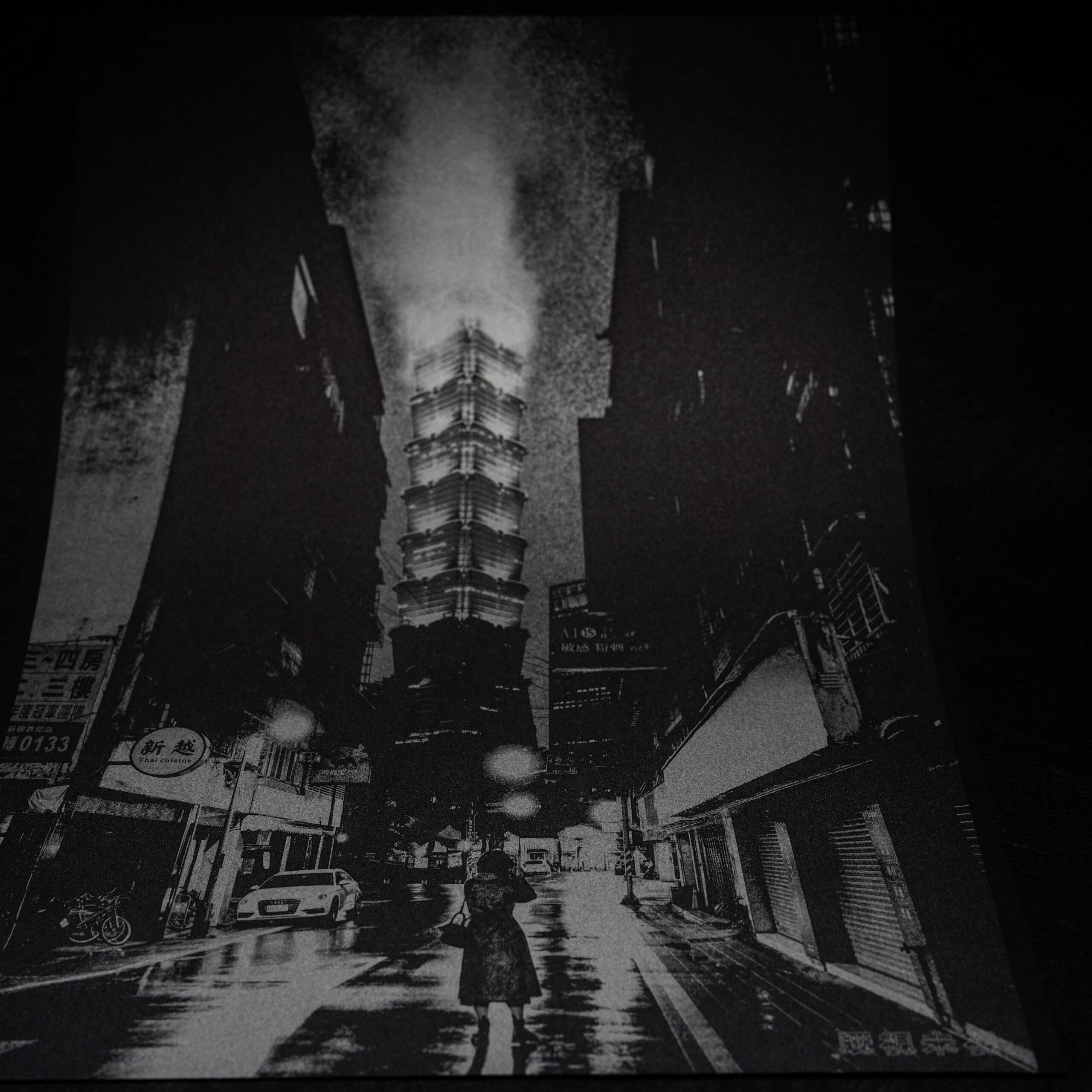
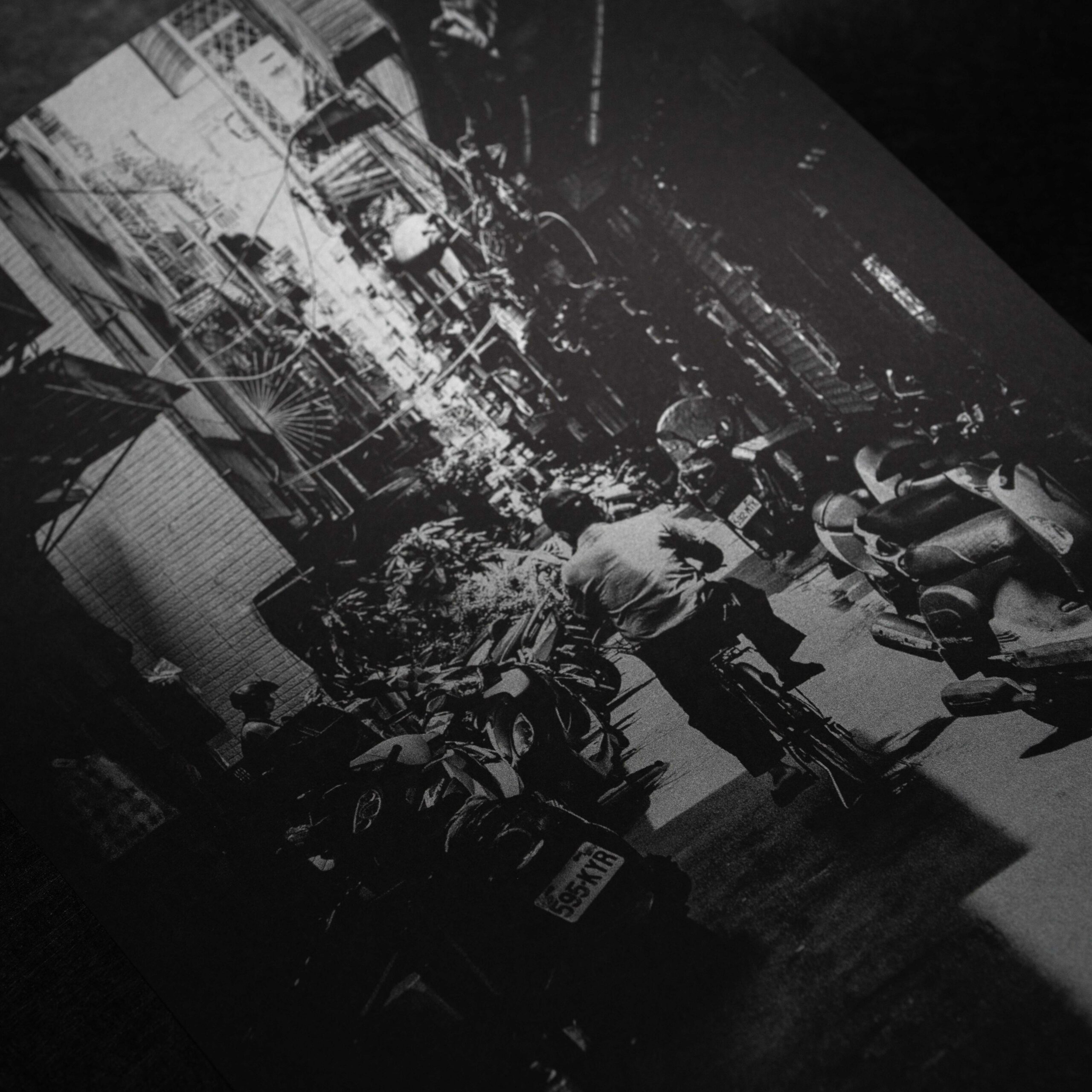
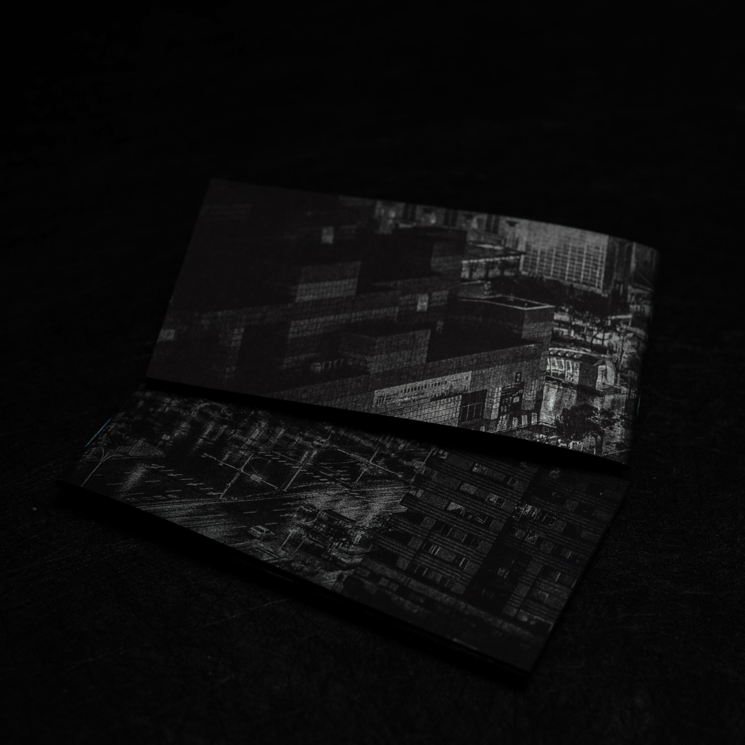
Traditionally, when creating black and white photography collections, the common method involves using white paper and then printing black ink on it. Depending on factors like paper selection, brand of black ink, density, and print quantities, the final outcome varies. Exploring these aspects, I realized that the black ink printed tends to deviate from the "ideal black" I envisioned for the composition and impression. Perhaps reversing the conventional approach of black and white production, by using black paper, could yield better results? With a mixture of excitement and apprehension, I experimented with various scenes and printing techniques. Eventually, I discovered an exquisite black paper from a German paper mill, the same black found in Leica camera packaging, which became my choice for black.
In Pursuit of "White" Ideal
I once pondered earnestly over a question: "What roles do black and white play in a composition?" If using white paper as a canvas and freely navigating within grayscale using black, this time, I chose black as a profound cradle and scattered white throughout the composition to infuse vitality into the work. However, white relies on small dots to create depth on paper and white ink itself doesn't reflect much light. Using only white ink can make the image feel rigid, so I aimed to add more layers to the work. Thus, the "ideal white" I sought was a combination of white and the reflective "silver" from a metallic sheen. Derived from a simple physical principle – object surface + light reflection = visual perception – I promptly decided to blend black paper with silver ink, thereby infusing a key element of vitality into this photographic piece.
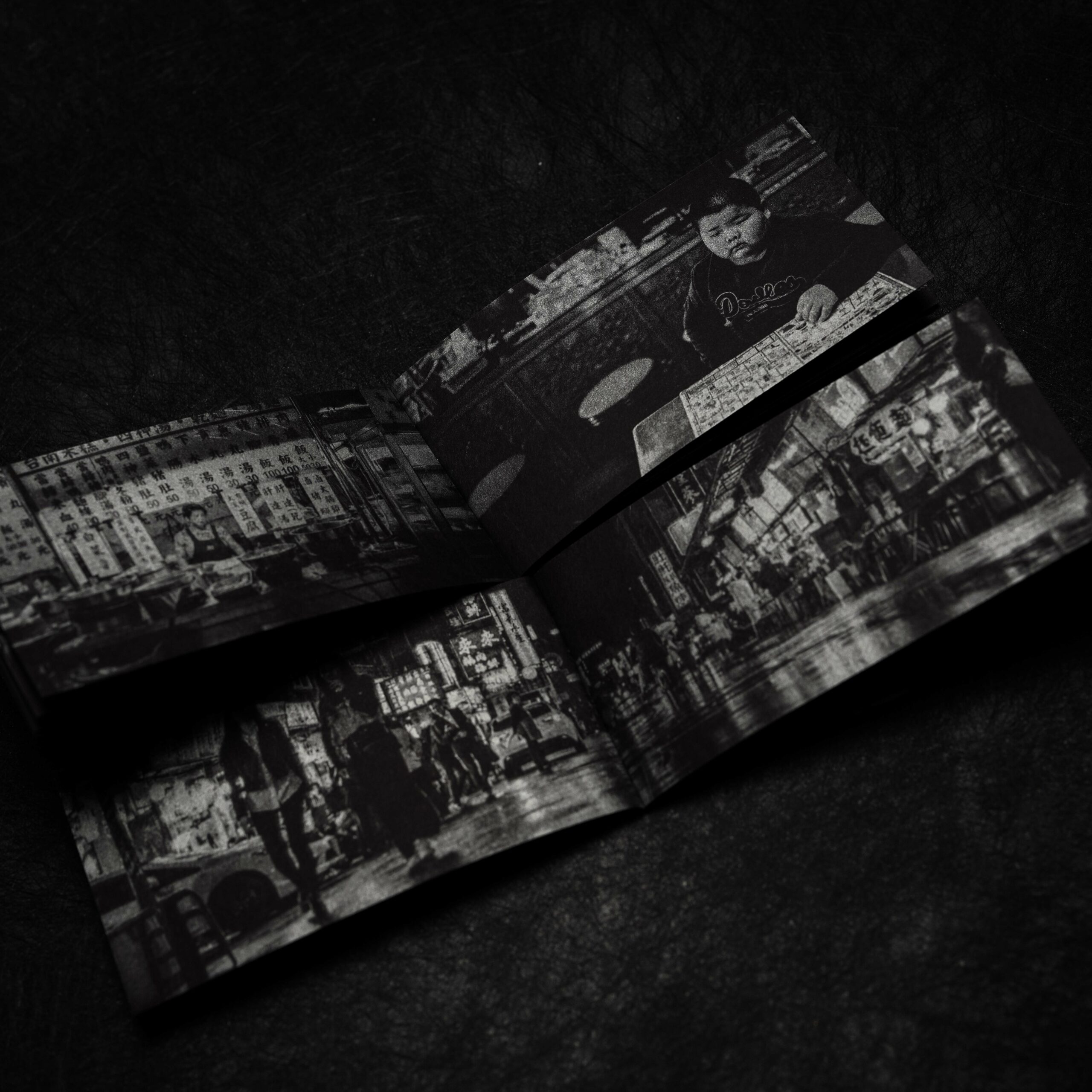
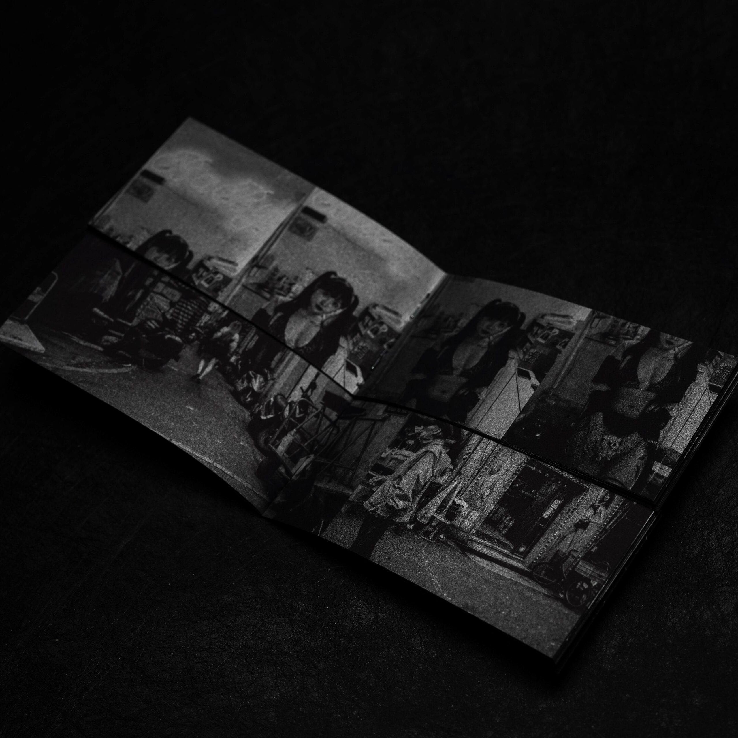
The Silver Between Black and White
All the photos within this article are printed in black and white using black paper and silver ink. The photos were captured under a small photography light, allowing the silver ink to reflect light while the black paper absorbs it. Achieving a delicate equilibrium between these two elements, the silver ink reacts differently based on the angles of light refraction, creating diverse reactions in the images. Like a gradually glowing light of life, as our perspective shifts, the emotions conveyed by the photos also vary.
Service Time
MON./ FRI.
AM09:00 / PM06:00
Copyright © 2024 Trouver co., ltd & The Paper Institute co., ltd All rights reserved.